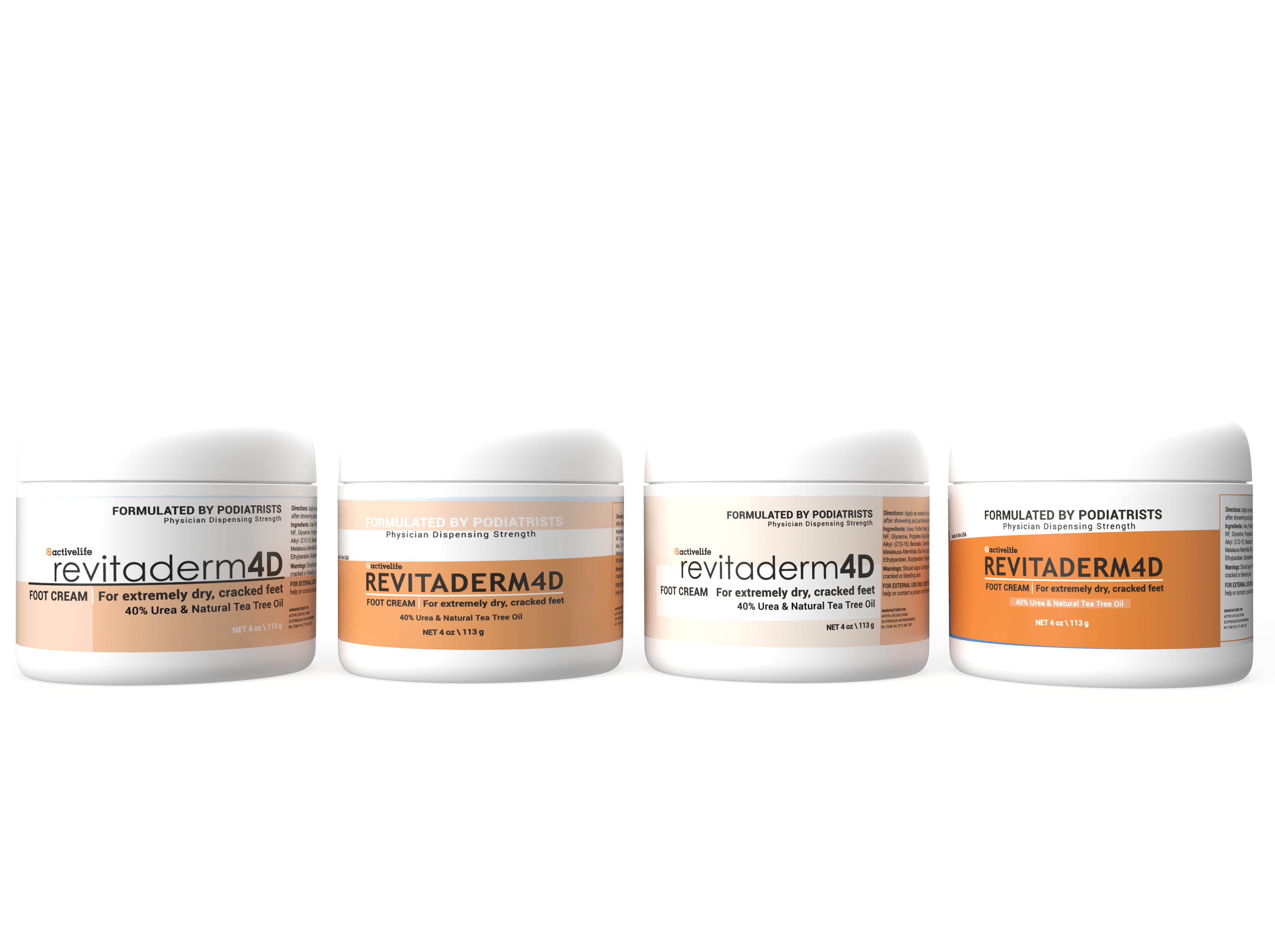
This project was for a private-label client. They had just refreshed their logo and wanted a new label design to go along with it.
I wanted to match the new logo's friendlier, bright design by utilizing the orange of the logo's mark. I also wanted to have variants using all capital letters to contrast the logo, as well as the opposite to complement it. To keep things modern, I explored with monochrome and color-blocking.