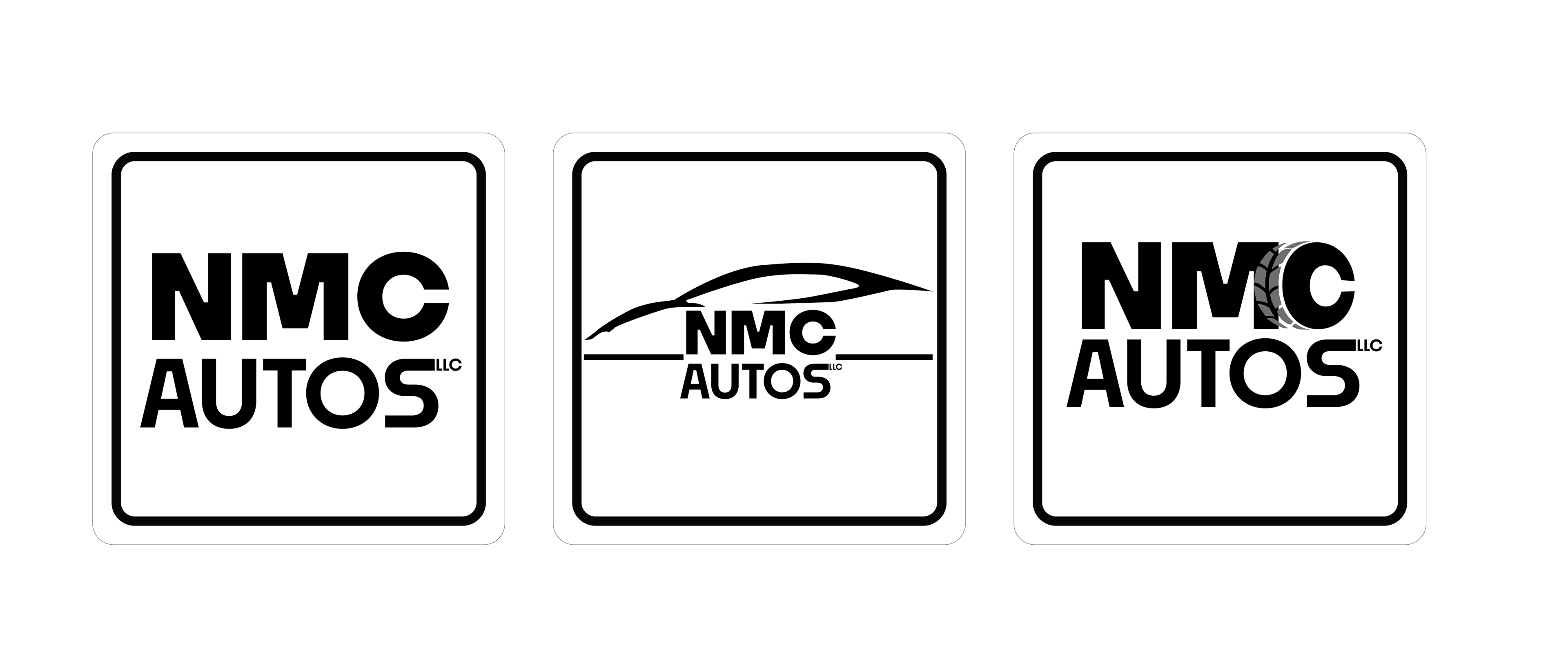
This client needed a logo for their new auto business. They didn't have an exact image in mind but wanted something clean and simple. I drafted 3 options for the client.
The first option is a fundamental logo, with just type. The second logo is the same wordmark, smaller, with an angular car outline. The third option is a variation of the first option with the "C" of NMC manipulated to look like a tire. My client loved the third option for their logo.