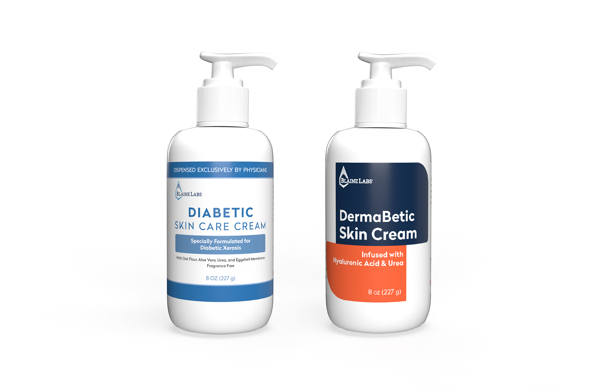
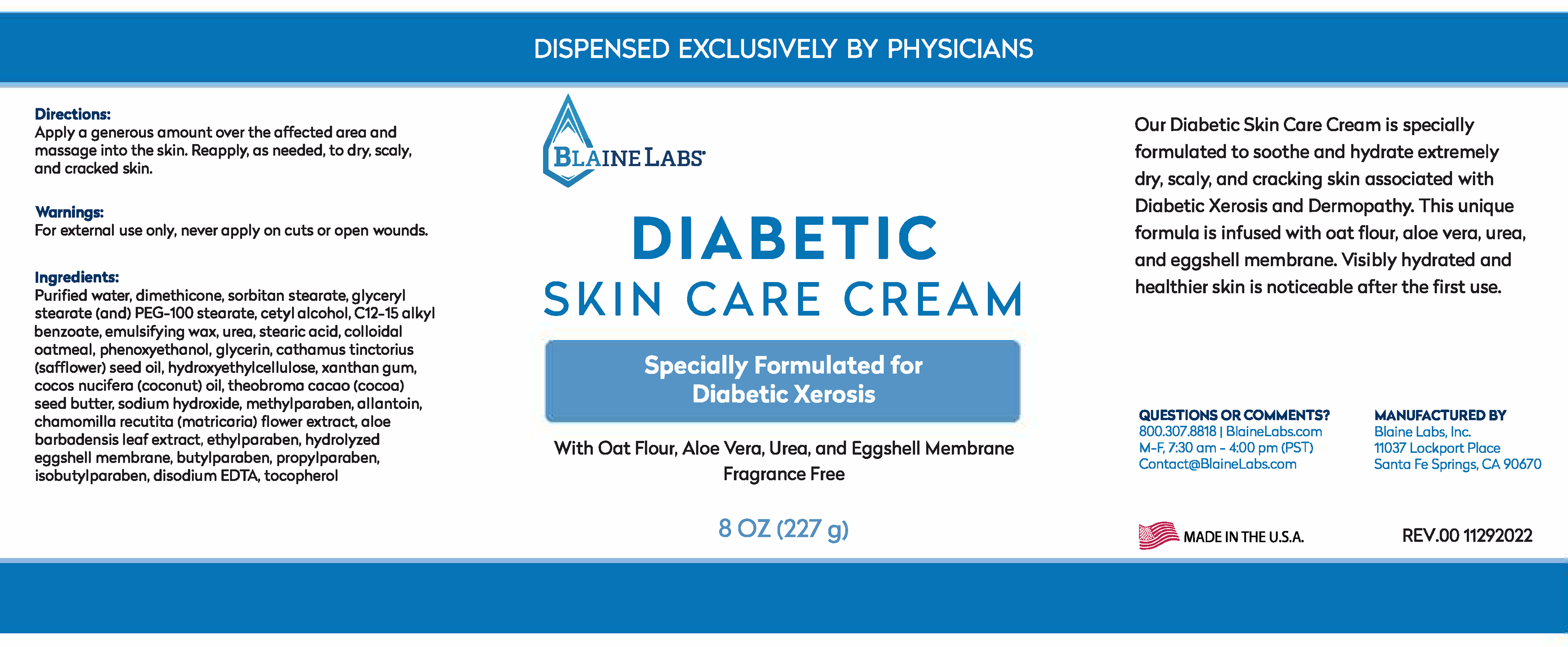
My task for this redesign was to give the original label a fresh, modern take.
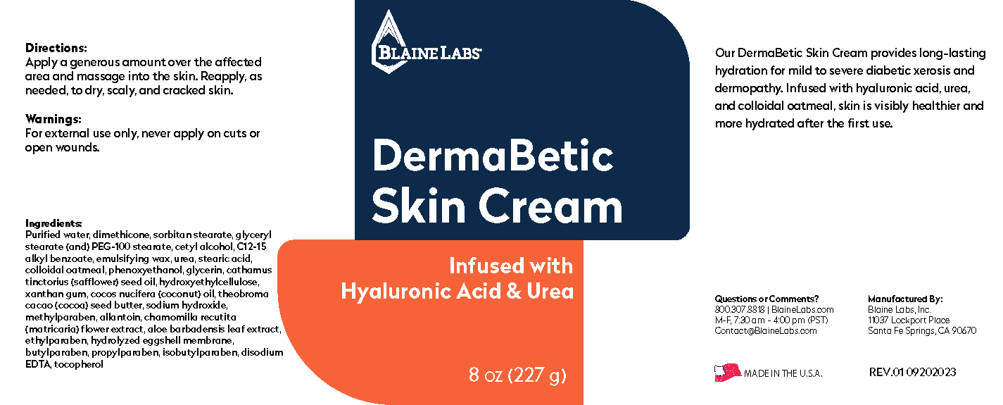
I decided to go with something bold with a color-block, abstract design. I chose blue as one of the primary colors to keep true to the original branding, and orange as a pop of contrasting color. I used the white space to bring focus to the design and colors.
The bold look and contrasting colors are sure to stand out on the shelves at doctors' offices.
before and after