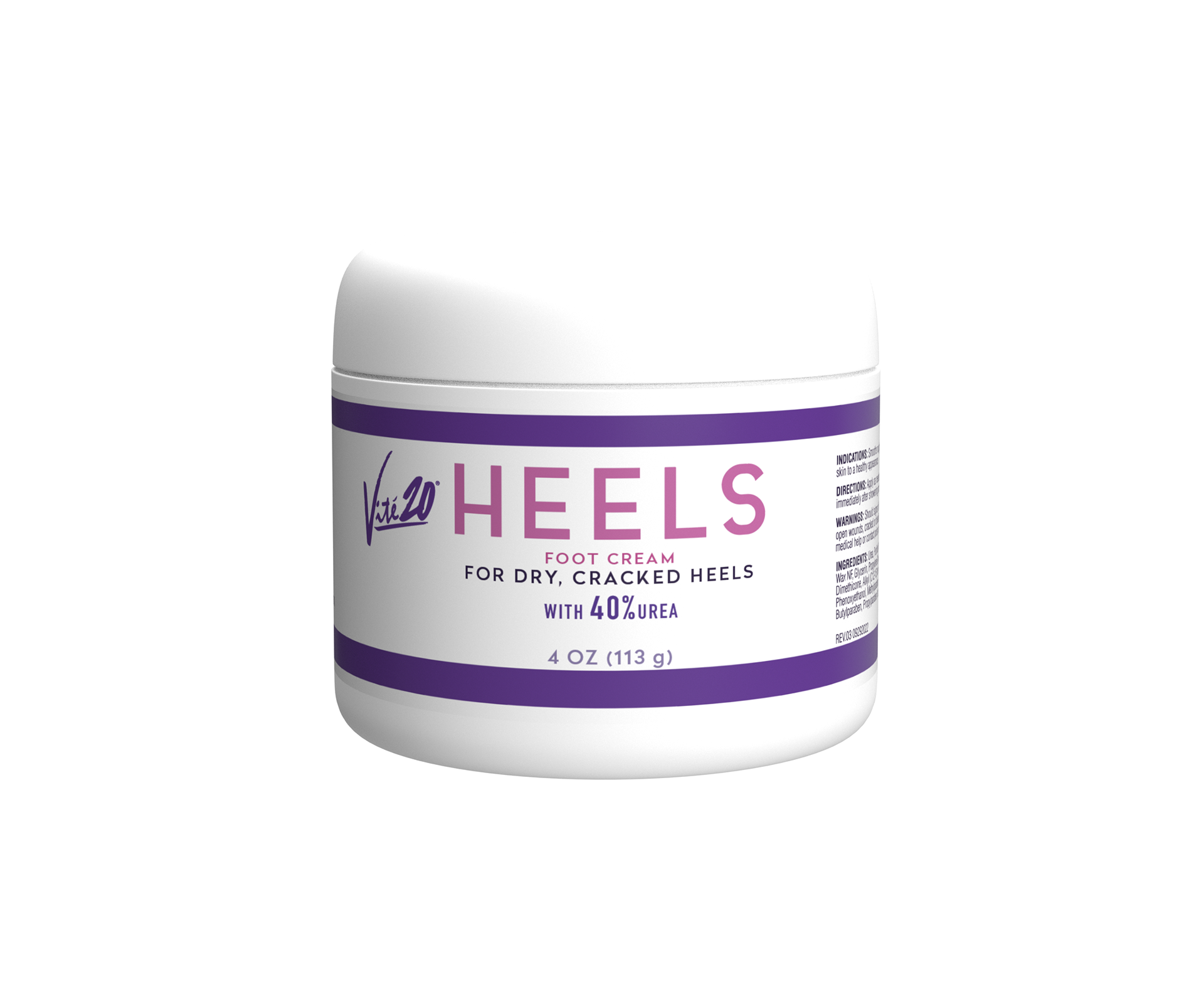
My task for this project was to give an update to vité20's emollient. There was a lot of feedback that the original design was a bit dated, as the product line hadn't been worked on since it was created in the early 2000s.
I wanted to keep the look similar while giving it a modern twist. The original label had too many fonts used and a lot of tension in the spacing. I decided to cut the font choices down to 2, the title and the copy. The proprietary name was shortened to be more straightforward for consumers and FDA-compliant.