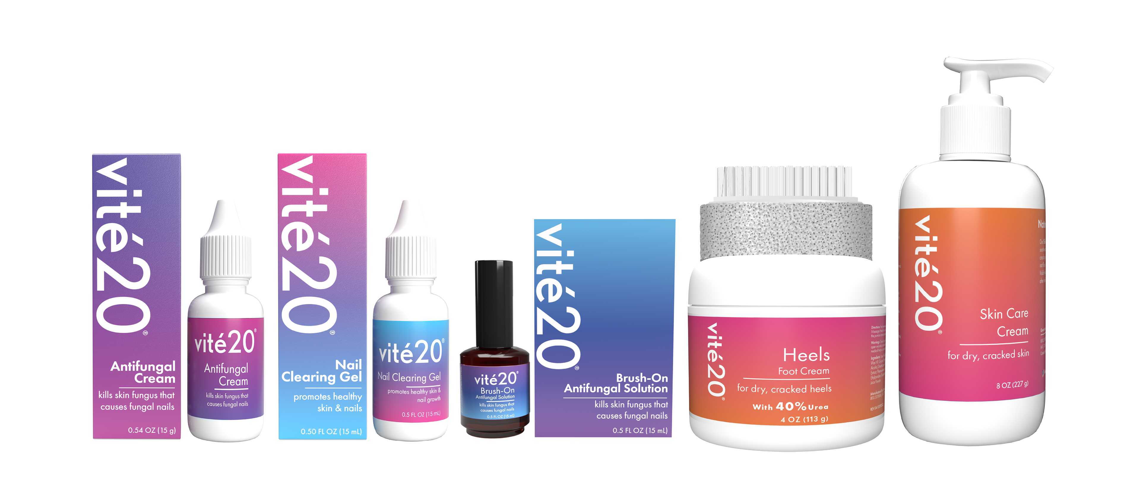
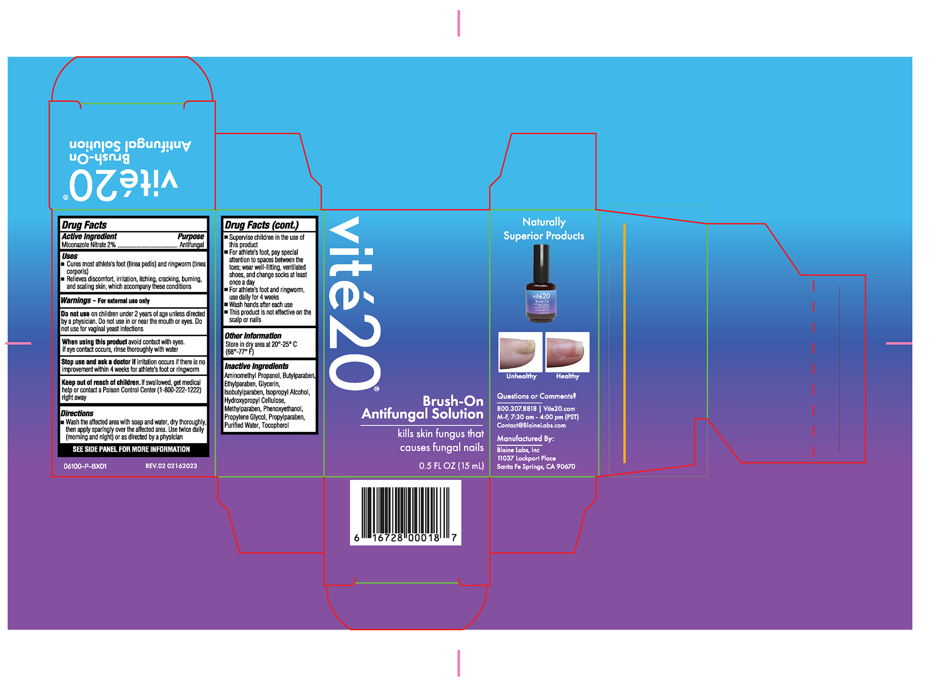
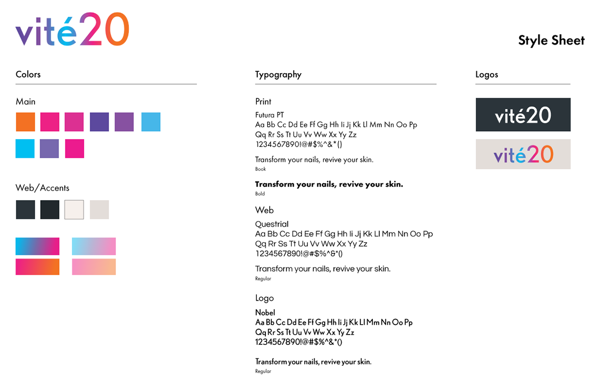
I was tasked with rebranding Blaine Labs's beauty line, vité20. I thought the original line definitely had the look of a product in a salon, but just a little dated. I wanted to breathe life into the brand and make it more eye-catching.
I decided to go with a gradient to give a modern, trendy take, as well as an all-lower-case logo. The brand is color separated between the 2 different lines. The skin care is orange and pink, and the fungal care products are blue, pink, and purple. I wanted pink to be the link between the two lines.
The colors are bright and vibrant to stand out on shelves, but the look and layout overall are very minimal to be trendy.

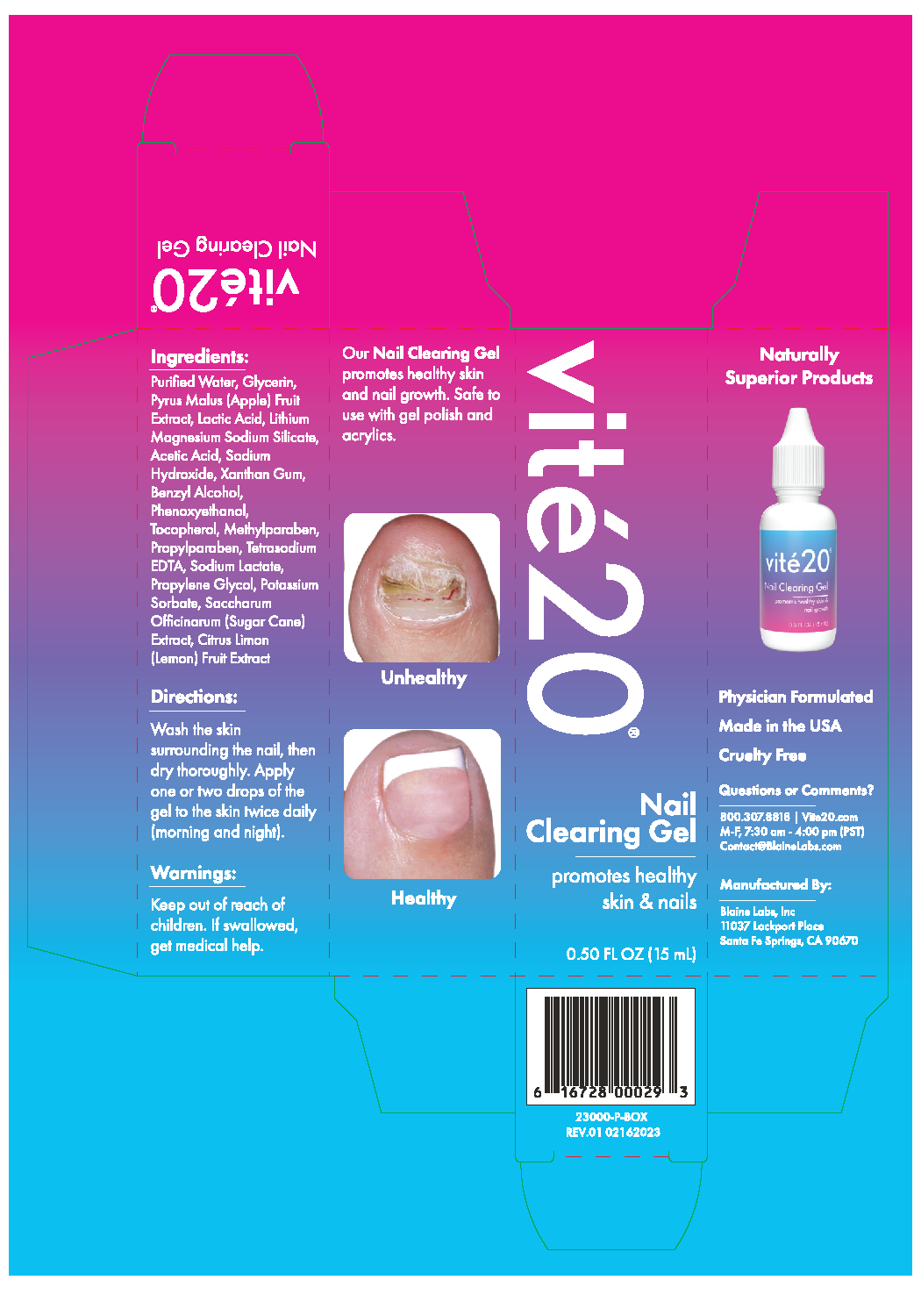
before and after